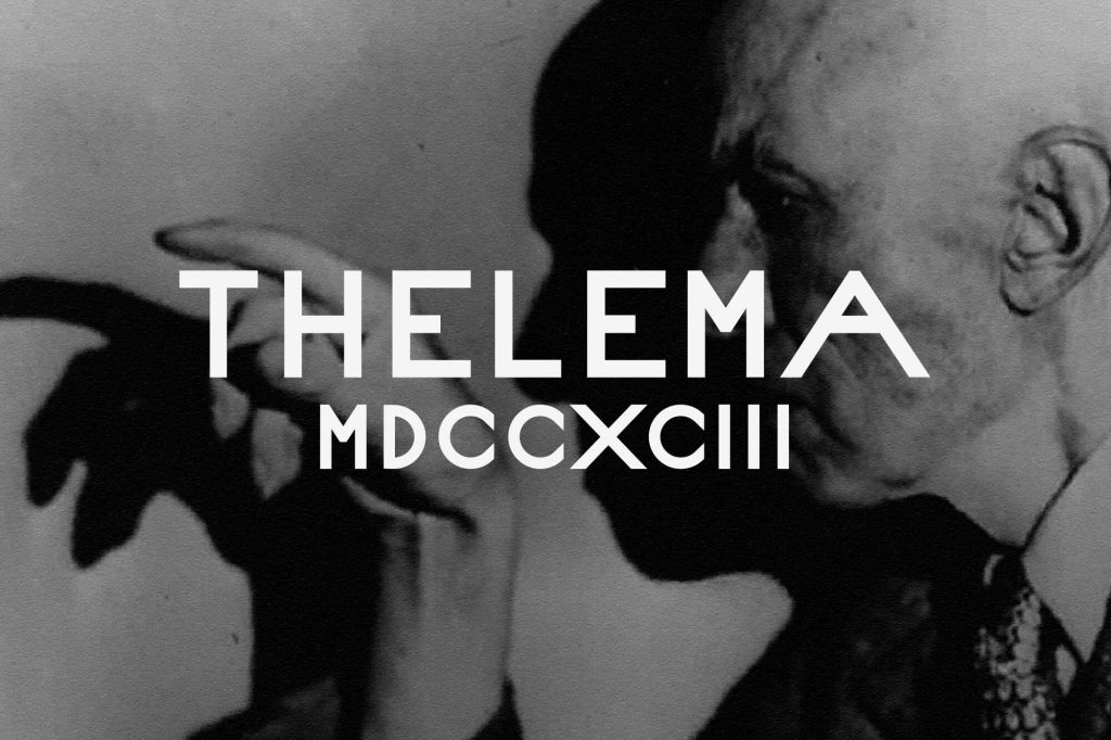
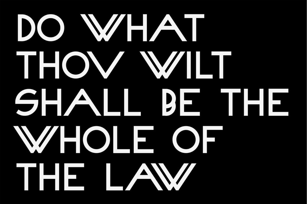
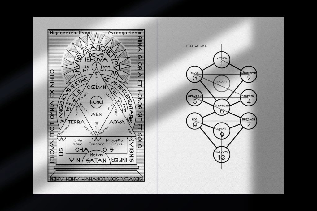
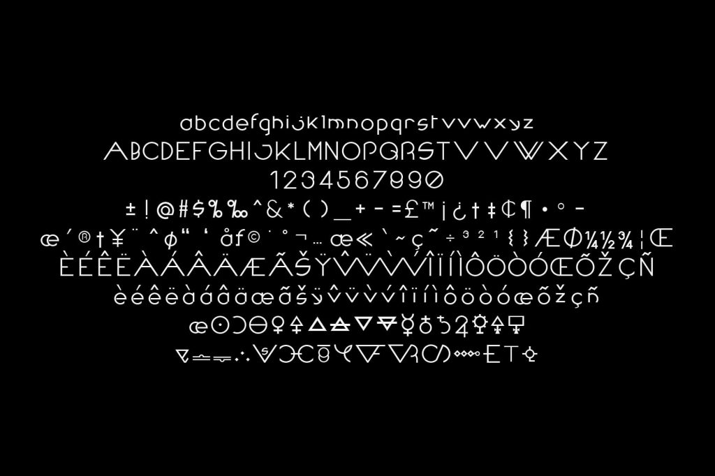
Thelema is a typeface developed as a typographic system, translating esoteric philosophy into a precise and controlled visual language.
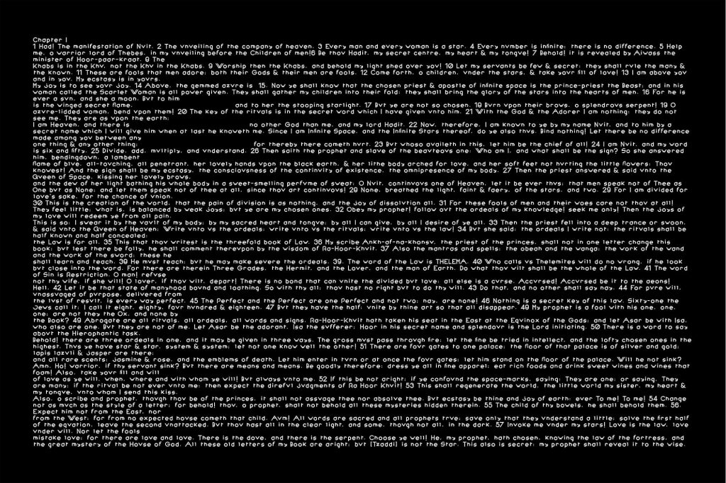
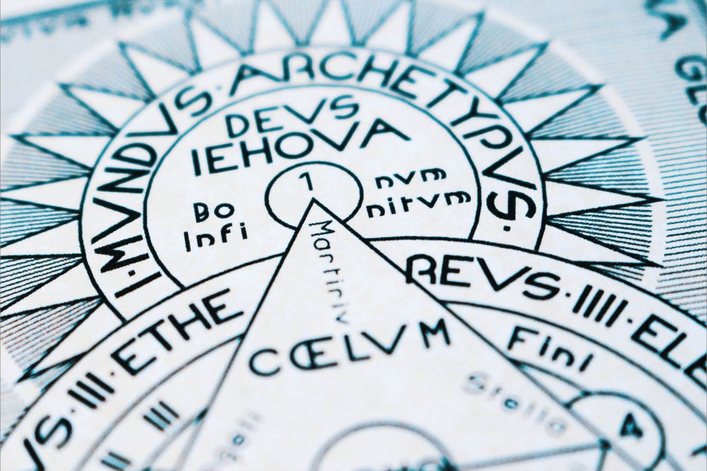
Drawing from symbolic structures and occult references, the project reinterprets complex cultural material through geometric reduction and formal clarity.
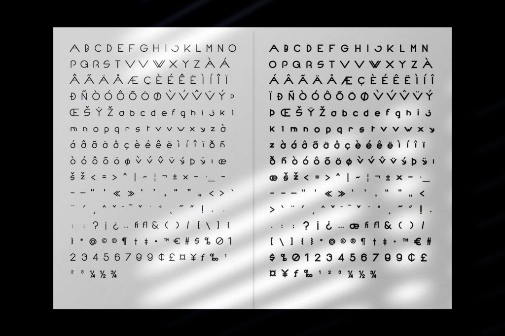
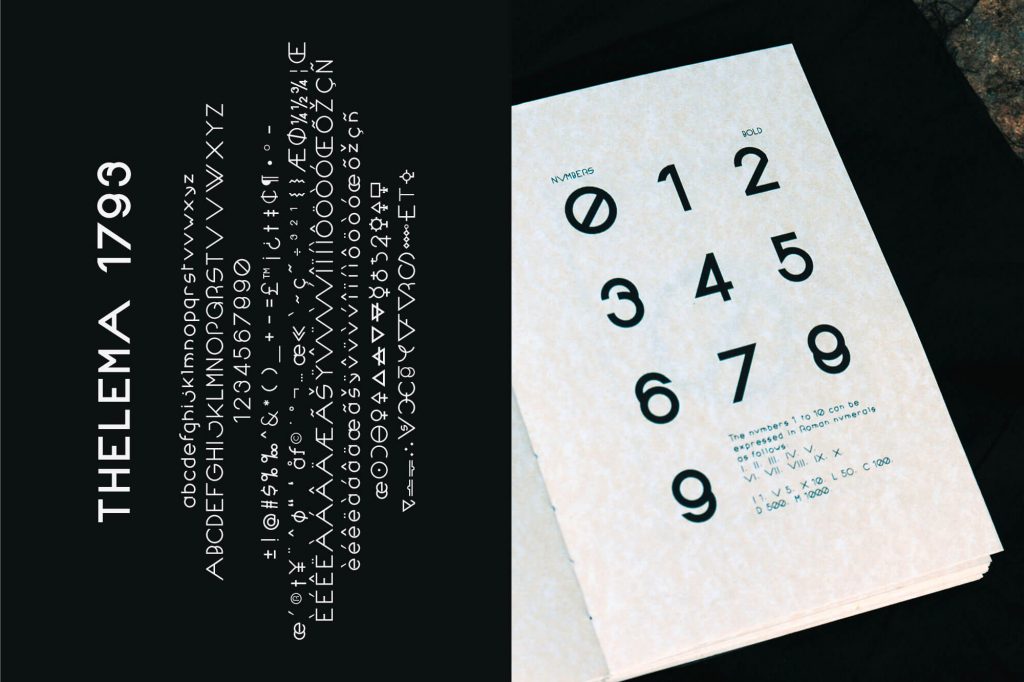
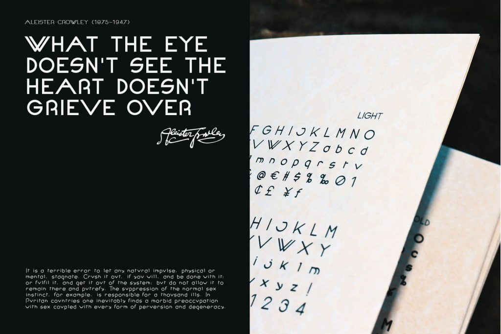
Built on circular forms and consistent stroke weight, the typeface establishes a rigid and systematic framework, contrasting with the ambiguity of its sources.
The letterforms extend beyond conventional proportions, introducing a controlled sense of tension within an otherwise ordered structure.
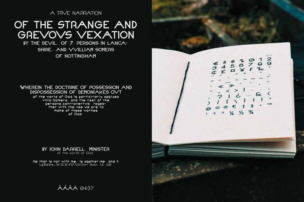
Applied across editorial compositions, the system positions typography as both a functional tool and a carrier of symbolic meaning.