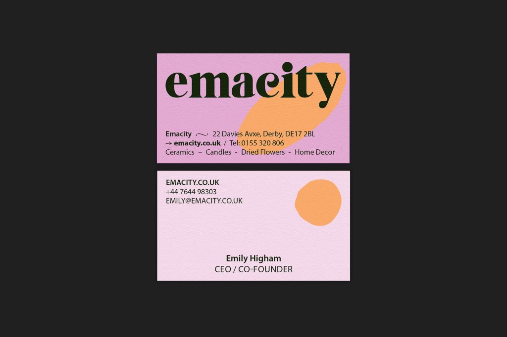
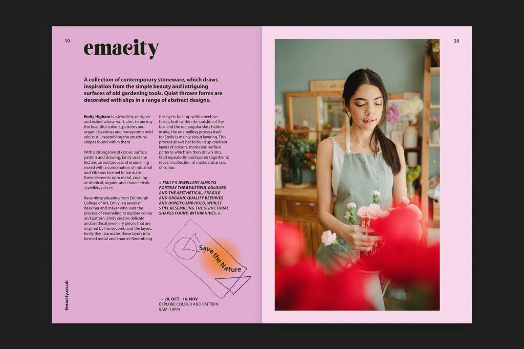
Draws on colours to embrace the environmental commitment, the vibrant identity for the little shop Emacity

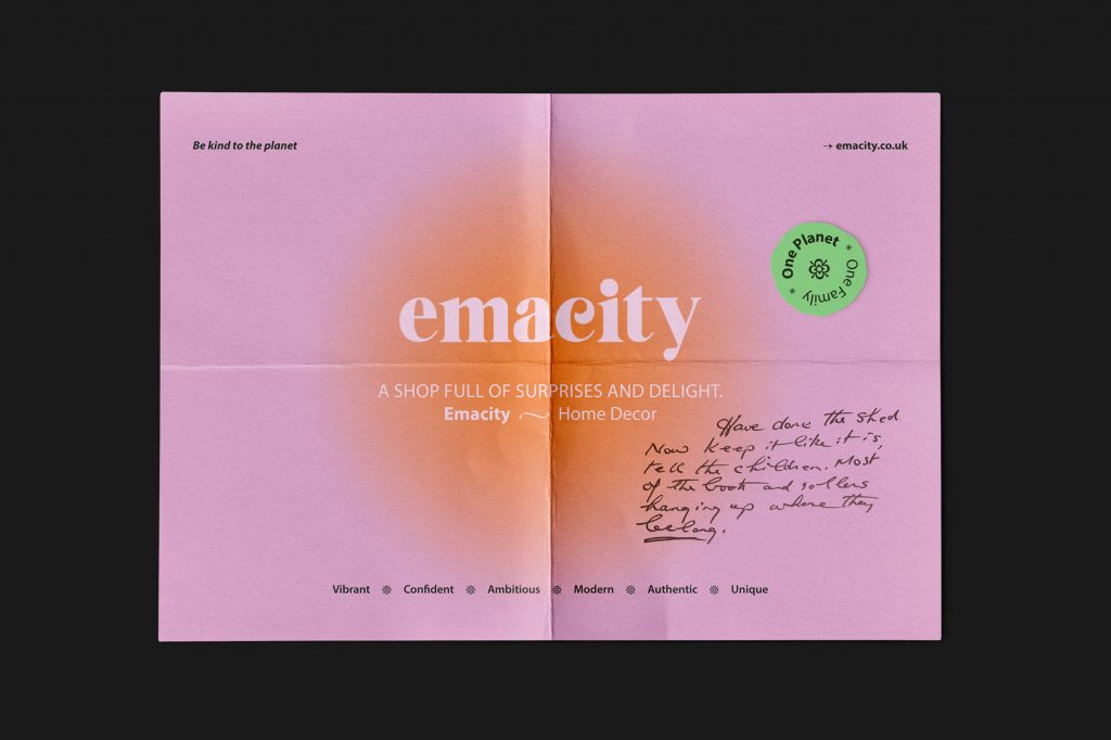
Emacity is an eco-conscious retail brand identity designed to translate environmental values into a clear and scalable visual system.

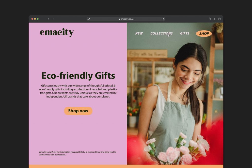
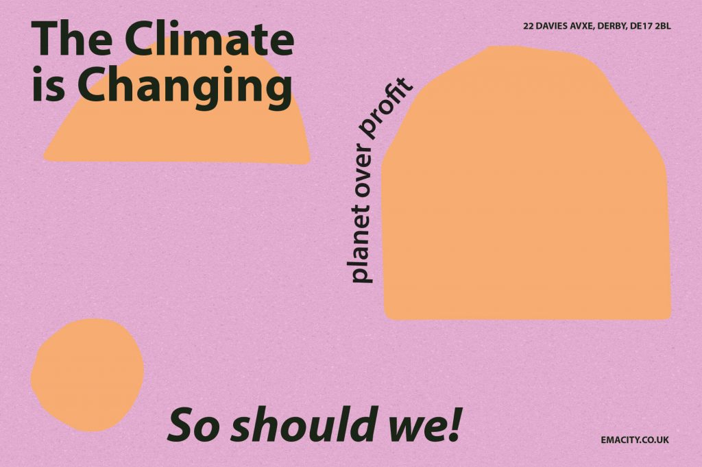
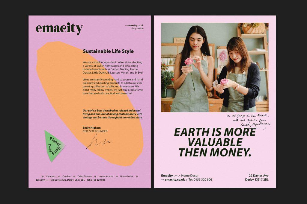
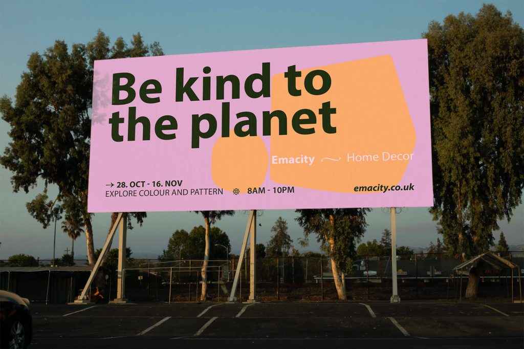
The project builds a flexible visual language where colour, typography and composition work together to communicate accessibility and environmental awareness.

Soft forms and vibrant tones introduce a sense of approachability, balanced by a structured system that ensures clarity and consistency across applications.

The identity extends across digital interfaces, social formats and print materials, maintaining coherence while adapting to different contexts.

The result is a visual system that positions sustainability as both functional and engaging.
Brand Identity / Art Direction / Digital / Print

©

Scroll to Top